Our Logo
Welcome! We’ve created this guide to help you use our logo. Read this page before you get started. If you need help, please reach out.
About Our Logo
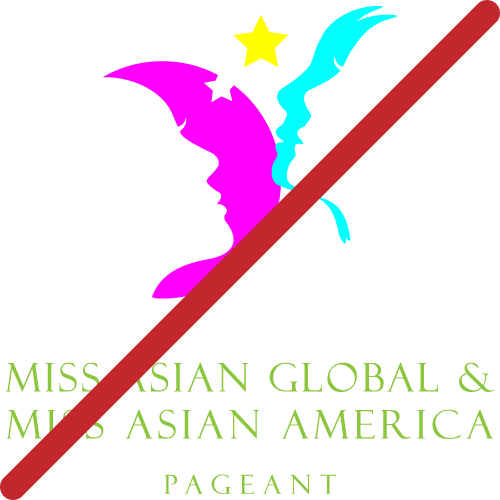
We are very proud of our Miss Asian Global Pageant logo. Developed in 2003 by designer Bill Chin, the logo resembles two faces forming a butterfly. The butterfly symbolizes the personal transformation each delegate undergoes during the pageant experience. Like a butterfly, each delegate brings change, joy, and hope to the world. Since 2006, Thomas Li has worked to translate the pageant design for the modern era.
Follow these guidelines to ensure it always looks its best.
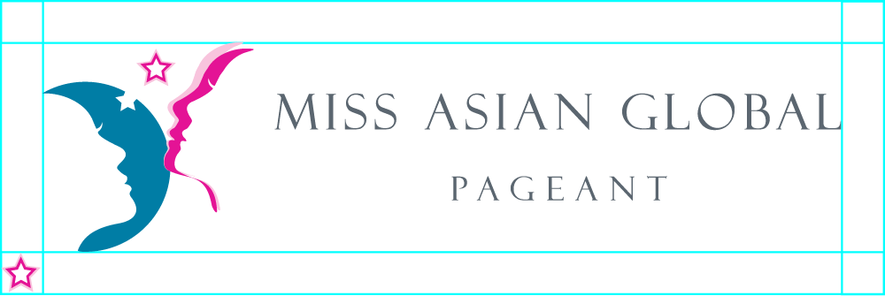
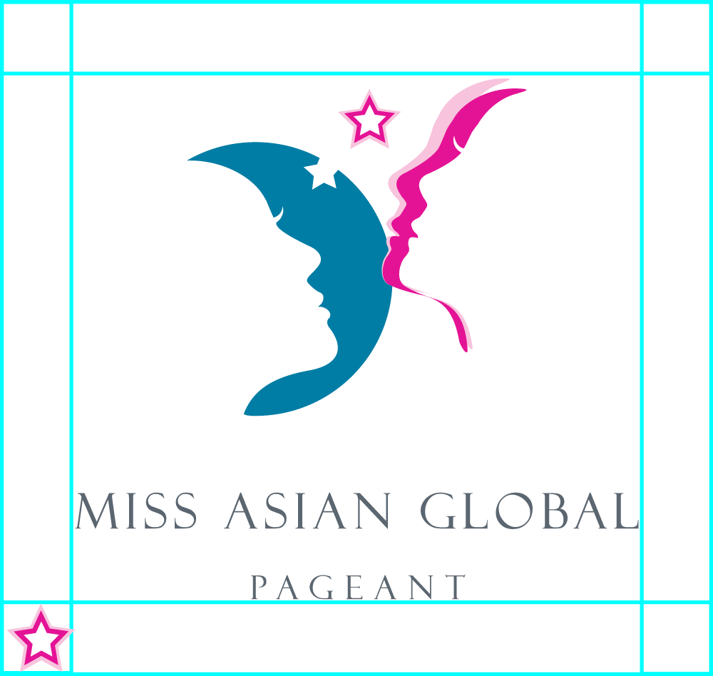
Each logo is available in two orientations, horizontal and vertical stacked. The orientation that best fits the proportions of the space available should be used.
Logo Options
Full Color
This is the logo you will use the most. Use the full-color logo for white or very light color backgrounds.
Exact colors used in logo:
Reverse Full Color
This is the full color logo with white text for darker backgrounds. You may use this logo on dark backgrounds or photo backgrounds, as long as it is in an area of the photo where you can see it clearly. If the photo is too light, we suggest applying a 10-20% black tint to the entire image, so that the white text is legible.
Exact colors used in logo:
One-Color Black
Use this one-color black logo for a subtler presence. For example, it’s useful in sponsor lists with other companies, black-and-white printing, or if the design prevents the use of color. You may use this logo on photo with light backgrounds too, as long as it is in an area of the photo where you can see it clearly.
Exact color used in logo:
One-Color White
Use this one-color white logo for black or dark backgrounds. You may use this logo on dark backgrounds or photo backgrounds, as long as it is in an area of the photo where you can see it clearly. If the photo is too light, we suggest applying a 10-20% black tint to the entire image, so that the white text is legible.
Exact color used in logo:
Just the Icon Logo
The icon logo is used on social media and in circumstances where only a smaller version of the logo will do. Without the name of our organization, people will not know the meaning of the icon logo. Make sure to use the icon logo with the name of our organization as written text. The Full Color version is the preferred choice.
Usage Do’s & Don’ts
Do provide Clear space
Clear space is the area surrounding the logo that must be kept free of competing text or graphic elements. The minimum clear space is measured by the size of the star ⭐ in the logo graphic. Leaving space around the logo clear ensures that it will stand out.
Do use a purple background
Here are some purple color backgrounds that will make the Reverse Full Color or the One-Color White logo stand out.
Do use a gold background
Use a bright gold background to make the Full Color or the One-Color Black logo stand out.
Do use a gradient background
Use saturated colors for gradient backgrounds to make the Reverse Full Color or the One-Color White logo stand out.
Don’t use busy or low contrast backgrounds.
Avoid using the logo over backgrounds that reduce legibility of the logo.
Don’t use the logo incorrectly
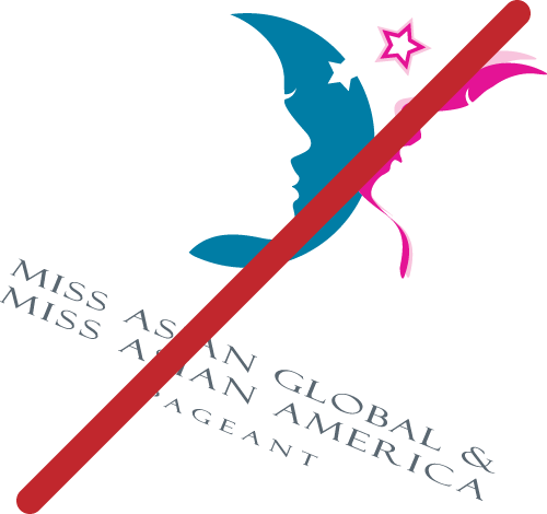
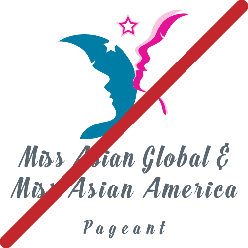
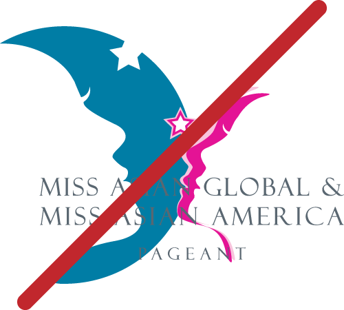
Keep the logo exactly as it is by not distorting, stretching, adapting, remaking, changing colors, changing placement, adding on, detracting from, or changing a thing. To ensure the identity’s strongest impact, do not modify or distort the logo.
Fonts
Typography
Typography is a crucial element of our visual identity. When used consistently, the font unifies messaging and creates familiarity. The following guidelines will help ensure maximum legibility and reinforcement of our brand.

Name of our organization
Font:

Large main headlines and decorative titles
Font:

Secondary headlines, subheads and section titles
Font:

Large blocks of body text set to sentence case. The minimum font size for body copy is 12 point to ensure your text is legible.
Font:
Font Colors
Our primary font color across titles and body text is Black. This should be used against white backgrounds. Our secondary font color is Serious Gray. This should be used for the organization name and subtext which sits close to headings.
Need Help?
Download the Right File
For most web/social media/digital use, click the Download button for the PNG file. The vector version of each logo is provided below the download button for use in printed materials. If you need the logo is a special format or would like to request the use of the logo, you must seek approval by submitting a request on our Contact Us page.
Thomas Li leads our Marketing team and developed this guide, along with the revised logo assets in June 2021. He reviews and approves all external-facing communications. For marketing support or approval, from collateral design to sponsorship requests and swag, please complete the online form on the Contact Us page.
